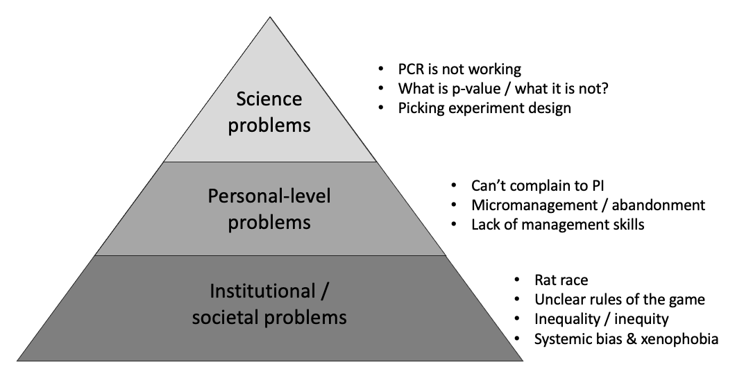
Problems can be roughly organized in hierarchy of complexity. The insight here is that you can’t solve lower-tier problems while using solutions on higher-tier level. For example, if your university doesn’t support you because of bias and xenophobia, you will not be able to solve that problem by “sciencing” harder or being smarter.
The bottom line is not that we can’t improve things from top-down, but it is much harder to do. Problem needs to be addressed on appropriate level.
Nobody cares until they have an empty box in their head
Why are you presenting and talk about A when the audience wants to hear about B? Well, for example, because A is the only thing you know how to talk about?…
If the audience of undergrads is looking for a lab rotation or research experience, don’t tell them about textbook molecular biology you are working on. Tell them how your day looks, and how the lab space looks
If the audience wants to know whether your microscope is good for their problems, don’t give lecture on physics of light. Show images of samples and experiments that come out.
If the audience wants to go home and be left alone… present the absolute minimum amount that will satisfy your supervisor, and let everyone free. Seriously, everyone loves when meetings end early
Q. What if you get to Q&A sooner, but there aren’t any questions?
A. Everyone goes to get a beer! Seriously, if there are no questions it means all questions were answered or the audience isn’t interested. In both cases it’s time to go.
— Andrey staying at home???? (@aandr314) May 22, 2020
I'm having problems keeping up with requests. I posted both files (as a single PDF) with an intro explaining my process on the first page of my group site: https://t.co/Q1qv1tnfNx
I put this together (with Jessica Luetger) for our campus reopening committee. I thought others may find it useful. "Literature on Returning to Work During the Covid-19 Pandemic"https://t.co/qQj5zftJ6u
I REALLY, REALLY hope we can return to in-person teaching in September (though I recognize that might not happen). Either way, here're some things I hope the ‘higher-ups’ at my university are thinking about NOW to make the return to school safe experience… whenever it may come:
Reopening colleges imho needs a mixed approach: labs and practical activities on campus, the rest online. It would simplify distancing and cleaning, while minimizing impact on learning. With three months for planning it is doable and quality can be maintained.
— Alberto Passalacqua (@errantThinker) May 2, 2020
In a phased reopening of MIT campus, a privacy-preserving opt-out mechanism proposed by #Isolat enables community members who feel uncomfortable to return to opt-out anonymously and work remotely. #covid19https://t.co/2NefYu5xiF
We are starting to make plans for returning to lab (date TBD). Initial conversations have included creating sufficient distance between researchers at the bench, staggering schedules, masks, effective sanitation of work spaces…what are else should we consider? @UMLifeSciences
Anyone trying to access my blog post from a few days ago on COVID risks, you can find it hosted here now. The volume of views couldn't be handled by the original server https://t.co/P1mg8cxARp
Qs for all scientists and academics: Has your research institute/University developed any guidelines for implementing return-to-campus and return-to-lab work? If so, would you mind sharing these with me? I'm interested in if/how other places are thinking about this tricky issue.
Yes I agree that lead time to return to work is important to communicate about plans. Here’s our work in progress plan if it’s helpful. Comments welcomehttps://t.co/7tVmOQIGUa
The unofficial greeting in the bilingual Canadian city of Montreal has long been a friendly “Bonjour, Hi!”
But that standard is no more since a motion mandating store clerks to greet customers only in French was passed in Quebec’s provincial legislature.
The problem is that Montreal is officially French-speaking. But English is extremely popular, and the main language of tourism. So ingenious citizens came up with “Bonjour-hi” as a way to be inclusive, and signal that they are capable of speaking english and french.
We have something to learn here. When in doubt: offer options.
When giving a suggestion, offer two if you don’t know for sure
When asking boss for advice, offer two possible solutions
When trying to make a decision, consider at least two options
When somebody is [un]comfortable, offer them option to stay or leave
Picking one out of two is hard, so let’s recall what Agile Software Development teaches us:
When faced with two or more alternatives that deliver roughly the same value, take the path that makes future change easier.
Dave Thomas
By following “Bonjour-hi” approach, we are not diluting power or wasting time, we are showing that we are empathetic and thoughtful. Offering option doesn’t need to be artificial, stick to your guns when you are sure. But otherwise — consider two options.
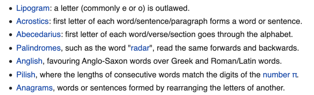
In writing, there is whole zoo of techniques or challenges (see wiki and TV Tropes articles) that aspiring artist can borrow from. In movies, one can try to make a film using a single continuous shot (Russian Ark) or only using natural light (even indoors, see Barry Lyndon).
In software development one successful artificial constrained that comes to mind is 10+ Deploys per Day at Flickr that contributed to the launch of DevOps culture.
All these attempts at meeting strict restrictions (apart from being artistic goal) lead to generation of very creative solutions. When used as an exercise, this approach attempts to artificially limit most crucial resources, or resources we are bad at managing. You can’t finish project in a month? Try one day! Always over monthly budget? Here is $50 / $100 / $150 for a week of groceries.
All these examples teach us valuable skills of time and resource management, allow us to get better at scope definition, and help understand what is slowing us down.
To work through the problem, force your process to be starved for key resource. The approach is to pick something that feels the most painful, and try to aim for it. You can only pick things you control (no “10 Science papers a year” but “10 co-authorships a year” is doable). In academics it is most likely going to be time.
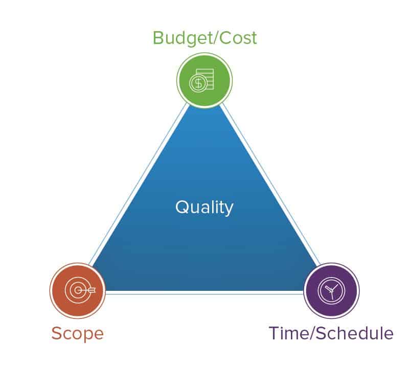
Triangle of doom. When restraining quality, we have to balance time, cost, and scope to achieve result. When one resource is limited, others need to be sacrificed
You will have to sacrifice some things: either pay more, or aim for lesser scientific achievement. But amount of information and training you’ll gain might be well worth it.
Updated on March 19, 2020:
As the world struggles through COVID-19, many labs are struggling with shut-downs, order to work from home, terrible expectations with salaries and funding, and more.
This is an opportunity. Not to out-work your competition. But to re-evaluate process, goals, and human aspect of the research. Each lab get an opportunity to take a break with daily grind, reset the clock, and establish new policies and management procedures.
It should not be just “do your best” but an opportunity for meta-discussion. We shouldn’t just “write”, but we should talk about how to write, and how to write better. Same for presentations. Same for lab management. Same for being a PI.
I started this blog to record ideas on running projects, making better presentations, and so on, in context of scientific research.
The goal of this site is to write down instructions, HowTos, protocols and checklist that could help manage research projects, get through grad school, and improve professional climate in academia.
Why is it called “Extreme Sciencing”? I shamelessly copied Extreme Programming for that name. In my experience, we can learn a lot from practices of software development, such as Agile, Scrum, or DevOps. I have spent time studying those and tried to borrow and adapt things that might help us with better sciencing.
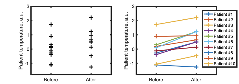
When highlighting difference between conditions, we can condense data in different ways. For example, we can start with bar graph with error bars. Asterisks signify significance level (p-value) of the difference between two conditions.
Bar chart with error bars compared to Gardner-Altman plot. Gardner-Altman plot shows data points as well as an inset that highlights what’s important: the difference between means of the two distributions and confidence interval. “+1.15C” is a bit confusing identification of that difference because it just “floats” in the space.
If we know that two conditions are applied to same sample (for example, we measure temperature of patient #1 before and after treatment) then it might be useful to show that using lines:
Example of line plot to show change in parameter before and after treatment. While most patients improved, there are some outliers. Paired-sample t-test, p<0.01
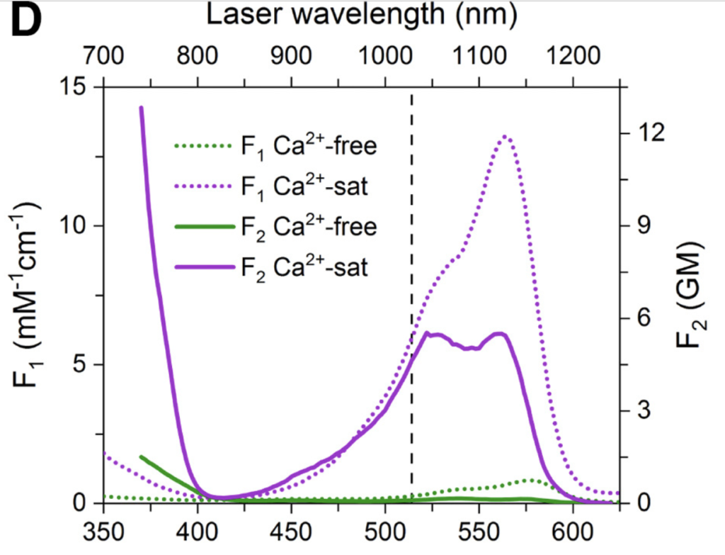
We sometimes want to show bunch of different stuff on the same plot. Consider this graphics, that overlays multiple fluorescence excitation spectra:
It took me a lot of time to understand it, because it uses two sets of axes for each subplot. That can be an effective tool, and can be easily implemented, say in MATLAB [example one] [example two], but it can also cause confusion. Let’s focus and try to improve single panel:
Panel D. Color represent amount of Ca2+ ions, texture represents single- (F1) or two-photon (F2) excitation modes
The plot is using color and dashing in order to define 4 different spectra of a calcium-sensitive fluorescent protein. Dashing is used to signify excitation mode (single-photon or two-photon) and color is used to mean presence or absence of calcium. This plot can be improved by flipping this relationship, keeping dashing for calcium amount, and keeping color for illumination mode:
Revised plot. Color now means means imaging conditions and matches axis
We can see, that least important information (plot of calcium-free fluorescence) is now hidden by dashing, and important stuff (the spectra of excitation) is elevated. We also color-coded the graph lines, as well as axis, so that two graphs can be viewed in the same panel, but also be distinguished visually: the purple line is being read using purple axis, and the green line is being read using green axis.
As final note, few resources on making graphics clear and statistically sound:
Great work by Edward Tufte, The Visual Display of Quantitative Information
Bonus points for problems from MATLAB certification practice test.
Extra bonus points: online interpreter of Octave with functionality of shared coding. You can loop in another person to help you get through. GNU Octave is designed to be compatible with MATLAB syntax
36 exercises for learning Python. It does require having development environment set up, and might require someone to help you at the beginning.
R and RStudio
Swirl is a library that you run inside RStudio, that guides you through tutorial
There is also an interactive online tool, LearnR hosted on RStudio’s Github
Javascript
There are many services that allow practicing JS. But we like Javascript because it can be useful for programming dynamic data visualization. Online platforms such as Glitch, Codepen or JSFiddle allow free-of-charge prototyping and sharing of small web applications.