Here is small program that works exactly like Pomodoro timer but also helpful in directing you. It tells you exactly what to do: that is, shut up — and write.
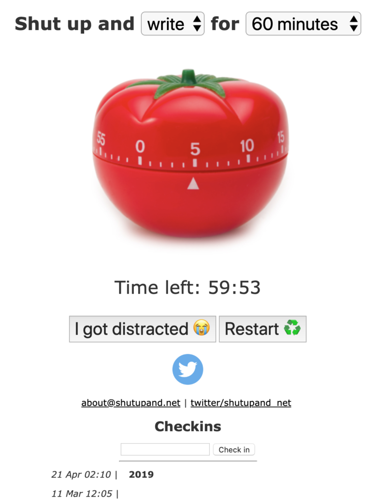
Here is small program that works exactly like Pomodoro timer but also helpful in directing you. It tells you exactly what to do: that is, shut up — and write.
This is a placeholder when we get enough energy to actually start campaign against open-floor office plans
Open-space is toxic and not cost-efficient, and it is time to get rid of it.
1-4 people offices with doors (and windows) or bust.
Reprinted from dev.to
Today I’ve been going through slides with fellow graduate student and came up with an analogy:
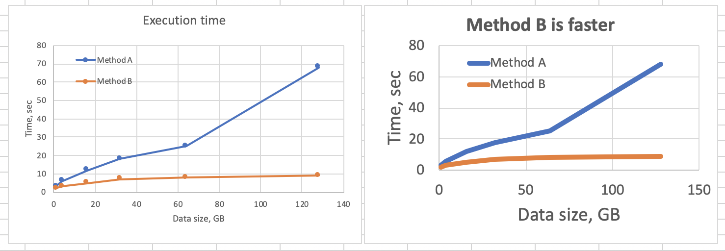
Each pixel of your slides costs you money
Now, consider how much you get back from each of the pixels you put out there. Was it really worth it? How much information did you provide, and how much have you paid for it?
In a sense, it is similar to “Data-ink ratio” idea introduced by Tufte. Difference is that “money” approach brings actual numbers to the stage.
When you put stuff on a slide, or on a plot, do you really get the most bang for the buck?
Most of the time, especially for the first 4 drafts, the answer is “no”.
How to get higher return on pixel?
this has to be here?We all know and love that great Q&A website, stackoverflow.com (or SO)
Well, we all should know and love it. But not many people I’ve met are aware of great variety of communities built using SO platform. Here are some of the favorites.
Ask or search existing questions for anything about higher education:
More general site for discussion of anything related to professional workplace. After all, we are working in academia and science too. This is perfect for students, trying to transition into research, since it covers:
Less known, but still useful site focussed on interpersonal relationships. There is a trope that some academics are not so good at communicating with friends and family, and this site might help.
For when we are done hacking our code and would like to make sure that it is at least reasonably written. Software is often a part of scientist’s job, so it should be done reasonably well
There are a lot of ways to make presentation better. And we should, since since is at least 75% presenting and talking about our work. Here some recent ideas from discussion reported by @AcademicChatter:
And a sad investigation when slides go wrong
This page describes set of principles we try to follow in our day to day science job. These ideas are stolen from many areas, mainly from software development practices.
We try to follow these methods ourselves and implement them in our teams
Latest version can be found and forked on Github: https://github.com/aandreev0/extremesciencing
Result of sciencing is clearly presented high-quality scientific results. It can be delivered as statistically significant observations of nature. It can be delivered as novel useful experimental protocols or data analysis tools that help discovery.
Central idea for engineers is that they design and deploy products, something tangible that will be used by other people. This could include microscopes, behavioral experimental setups, analysis and control software, data management solutions, and other elements of research environment.
This means that projects should be treated in such a way that: